18 Mar Digital Exhibition Design and Layout Tips
A digital exhibition provides an exciting venue for presenting inventive stories, interacting with viewers, and demonstrating innovation. Effective design and layout are essential in today’s digital world to draw people in and create lasting impressions. When it comes to digital art displays, the canvas is far larger than the actual walls. Digital exhibits use technology and art to create immersive, interactive experiences that go beyond convention. Good layout and design are essential because they open the door to drawing viewers in and encouraging deep interactions with the artwork.
Understanding Your Audience and Goals
Understanding your audience and objectives is pivotal in crafting impactful exhibitions. By identifying your target demographic and discerning their expectations, you can tailor the exhibition experience to align with their interests and preferences. Clear goals, whether educational, engaging, or promotional, serve as a roadmap for shaping the exhibition’s narrative and influence. This means that by having a clear understanding of what you want to achieve with your exhibition, you can better shape the content and presentation to meet those objectives. Whether you aim to educate, entertain, or promote a certain idea or product, having defined goals helps ensure that every aspect of the exhibition—from content selection to presentation style—effectively communicates your message and resonates with visitors, leaving a lasting impression.
Choosing the Right Platform and Format
Selecting the appropriate platform is crucial for delivering content effectively. Explore various options such as websites, virtual reality (VR), and augmented reality (AR), weighing their advantages and limitations in alignment with your content and audience. Additionally, prioritize compatible file formats for images, videos, and interactive elements to ensure seamless accessibility. This means considering factors such as file compatibility across different platforms and devices, as well as ensuring that the chosen formats optimize the user experience and facilitate smooth interaction with the exhibition content.

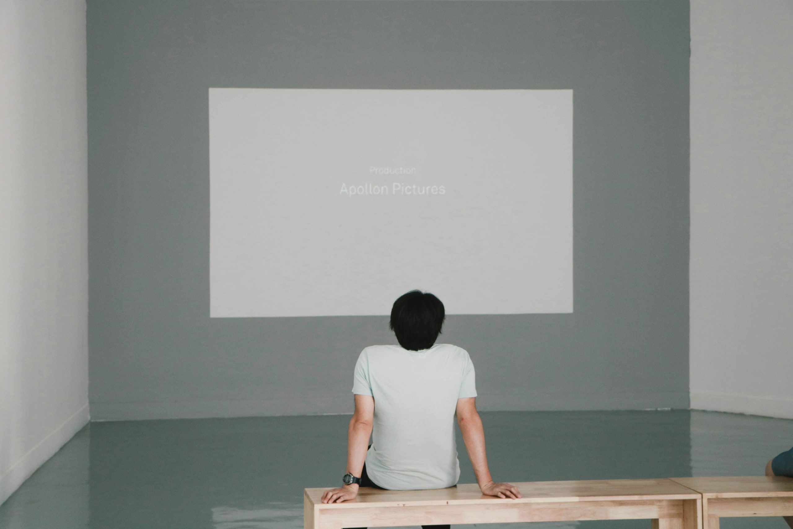
Photo by Kelvin Han
Organizing Content and Navigation
Seamless navigation is the cornerstone of a rewarding visitor experience. Organize content logically, whether chronologically, thematically, or through interactive storytelling, facilitating intuitive exploration. Clear labeling and contextual information for each exhibit enhance engagement and comprehension. This involves structuring the exhibition in a way that guides visitors through the content logically and intuitively, making it easy for them to navigate between different sections or exhibits and understand the context and significance of each.
Designing for Engagement and Usability
Visual hierarchy and design elements guide visitors through the exhibition’s narrative, fostering engagement and comprehension. Incorporate interactive elements, multimedia content, and accessibility features to enrich the experience for diverse audiences. Optimize loading times and ensure responsiveness across devices to maximize accessibility. This entails designing the exhibition with user engagement and usability in mind, making use of visual cues and interactive elements to captivate visitors’ interest and enhance their understanding of the content, while also ensuring that the exhibition is accessible and easy to navigate for people with disabilities or using different devices.
Testing and Refinement
User testing is essential for refining the exhibition experience. Solicit feedback from potential visitors, identifying usability issues and areas for improvement. Iterate on the design based on insights gleaned from testing, ensuring continuous refinement and alignment with audience expectations. This involves conducting thorough testing of the exhibition prototype with representative users to identify any usability issues or areas where the user experience could be improved, and then incorporating feedback and making necessary adjustments to the design to ensure that the final exhibition meets the needs and expectations of its intended audience.

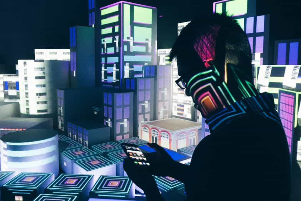
Photo by summertrain
Conclusion
Designing effective digital exhibition layouts demands a strategic blend of creativity, technology, and user-centricity. By understanding your audience, leveraging the right platforms, and prioritizing engagement and usability, you can craft immersive experiences that resonate deeply with visitors. Embrace emerging trends and technologies to shape the future of digital exhibition experiences.
Key Takeaways
- Understanding Audience & Goals: Tailor the exhibition experience to match audience interests and preferences by identifying target demographics and clear objectives. Defined goals serve as a roadmap for shaping the exhibition’s narrative and influence.
- Choosing Platform & Format: Select the most suitable platform (e.g., websites, VR, AR) and file formats for images, videos, and interactive elements based on content and audience. Consider compatibility across devices and optimize formats for seamless accessibility.
- Organizing Content & Navigation: Organize content logically and facilitate intuitive exploration through clear labeling, contextual information, and logical structure. Seamless navigation enhances visitor engagement and comprehension.
- Designing for Engagement & Usability: Employ visual hierarchy, interactive elements, multimedia content, and accessibility features to enrich the visitor experience. Ensure responsive design and optimized loading times across devices for maximum accessibility.
- Testing and Refinement: Conduct user testing to solicit feedback, identify usability issues, and refine the exhibition experience based on insights gathered. Iteratively improve design to align with audience expectations and enhance overall usability.
FAQs
How do I choose the right platform for hosting my digital exhibition?
When selecting the ideal platform for hosting a digital exhibition, it’s essential to carefully evaluate your content and understand your audience demographics. By considering these factors, you can effectively align your objectives with the capabilities of different platforms. For instance, if your exhibition targets a tech-savvy audience, you might opt for a platform that offers advanced interactive features and seamless navigation. Conversely, if your content caters to a more traditional audience, a user-friendly platform with straightforward navigation might be preferable. Ultimately, choosing the right platform involves finding the balance between the features you need and the preferences of your audience.
What are some effective strategies for organizing content within a digital exhibition?
In organizing content within a digital exhibition, there are several effective strategies to consider. You can opt for chronological organization, which presents content in a sequential order, allowing visitors to follow a timeline and understand the progression of events or ideas. Alternatively, thematic organization groups content based on common themes or topics, making it easier for visitors to explore related materials in depth. Another approach involves interactive storytelling, where content is presented in a nonlinear fashion, encouraging engagement and exploration. By carefully selecting the organizational strategy that best suits your exhibition’s content and objectives, you can enhance the visitor experience and ensure that your message resonates effectively.
How important is user testing in the design process of a digital exhibition?
User testing plays a crucial role in the design process of a digital exhibition. By soliciting feedback from actual users, you can identify usability issues, uncover areas for improvement, and gather insights into how visitors interact with your exhibition. User testing helps ensure that the exhibition’s design and functionality meet the needs and expectations of your audience, ultimately enhancing the overall user experience. Through iterative testing and refinement, you can address usability concerns, optimize navigation pathways, and fine-tune interactive elements to create a compelling and user-friendly exhibition. By prioritizing user testing throughout the design process, you can increase visitor satisfaction and maximize the impact of your digital exhibition.
Spotlighting “Educational Programs Promoting Artistic Cultural Exchange” that are designed to facilitate artistic cultural exchange and cross-cultural understanding.

